
Welcome again!
As usual, please feel free to comment (in the comment section of this blog). Introduce yourself. Say what you like, what you don’t like, etc. (but keep it on topic). Discuss with your fellow time-series travellers. Enjoy!
And, watch the videos.
As per suggestion, I’ll include the “slides” as a pdf file for you to use:
Some problems:


This course is brought to you free of charge, but we do need donations to keep it alive. You can join the many others whose generous support has made it possible with a donation at Peaseblossom’s Closet.
UPDATE:
As per further request, here are the slides for the first two lessons:

Tamino, can you post the slides for lessons 1 and 2?
[Response: See the UPDATE at the end of this post.]
LikeLike
Thanks for the slides – much appreciated!
LikeLike
I agree. The slides are complete and well done. Having them allows the student to watch the vid without having to take detailed notes.
LikeLike
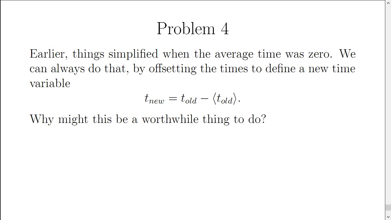
See how this works out. For Problem 4 on shifting the time scale by :
For a linear regression, one thing shifting the origin does is it puts the mean of x and the mean of t_new at the center of the plot and it becomes easy to see what the data is doing relative to the mean.
It was shown in the lecture = beta_0 + beta_1 so t = t_new and = 0. So the regression line intercept becomes the mean of the data.
Here is HadCru global temperature amomalies and regression line with time centered at the origin:
For comparison here is the unshifted HadCru global temperature anomaly data together with the regression line:
LikeLike
Here is a second try with some changes that hopefully improve the first try.
For Problem 4 shifting the time scale by the mean of the time variable E(t):
For a linear regression, one thing shifting the origin does is it puts the mean of x and the mean of t_new at the center of the plot and it becomes easy to see what the data is doing relative to the mean.
It was shown in the lecture E(x) = beta_0 + beta_1*E(t), t = t_new and E(t) = 0. So the regression line intercept becomes the mean of the data.
Here is HadCru global temperature anomalies and regression line with time centered at the origin:

For comparison here is the unshifted HadCru global temperature anomaly data together with the regression line:

LikeLike
Problem 1
The following time series has a bit of a story with it so it was used for this problem.
The time series data that resulted in the plots below is the HadCru global temperature anomaly data set over the period of 1970 to 2015. But it is not the standard data referenced to the period 1961-1990, instead this data is referenced to the period 1850-1900. Now one might wonder why would anyone be interested in a data set referenced to that period. Well as this article from the British Met Office
http://www.metoffice.gov.uk/research/news/2015/global-average-temperature-2015
indicates this period serves (at least in some sense) as the pre-industrial level that we often hear cited to in news articles or discussions on global warming science, policy etc. In the notes and references they give their rationale for using this period. So the data in the plot below is temperature anomaly above the pre-industrial level defined in the article.
The British economics historian TS Ashton put the Industrial Revolution as occurring from 1760-1830 so pre-industrial is taken as before 1760. That being the case there may be model based methods used to determine the pre-industrial levels commonly cited, but I was unable to find any. The IPCC AR5 had a couple of references to the 1850-1900 reference period and many references to pre-industrial levels but I found no explicit mention on how they determine temperatures relative to the preindustrial era though maybe there is something in there.
This data was kindly provided to me by the good people at the Met Office as it is not typically available at the their data website. It included monthly anomalies as well and all their standard uncertainty measures. Actually the anomalies referenced to 1850 to 1900 could be derived from those referenced to the 1961-1990. Method to do this were discussed at Open Mind a few years ago when questions arose as to how to find a common baseline for temperature data sets with different baselines.
Anyway the plots for the data. The results are similar to those for the NASA data given in the Session 3 presentation,:
Measurements and regression line:
beta_1 = .016996 degC/yr beta_0 = -33.316 degC
For 2015 the measured value was 1.06 degrees above pre-industrial and the estimated value was about .931 degrees above
Regression Residuals:
First 20 lags of the autocorrelation function of the residuals with the +2 sigma thresholds:
The visual test shows there is little reason to believe that the residuals are not white, The Ljung Box test produced a p-value of .4056 thus failing to reject the null hypothesis of no autocorrelation so it is consistent with the visual test of the autocorrelation function.
LikeLike
Problem 2 -Fitting to a Quadratic and Problem 5- Five Regression Fits centered at the origin.
This series is a another headliner often seen in the discussions of the impacts of AGW, Arctic Sea Ice Area. Actually it is it’s close relative Arctic Sea Ice Extent that is probably more often seen. The series here is Arctic Sea Ice Area for September, the yearly minimum area, over the satellite observation period 1979-2015. Arctic Sea Ice data analysis has been and continues to be a subject of intense investigation at Open Mind which provides an excellent compendium of time series analysis on this topic.
Anyway the plots for the data:
Measurements and regression curve:
beta_2 = -0.0027093 million sq km per yr^2, beta_1 = 10.775 million sq km per yr, beta_0 = -10708.344 million sq km
Regression Residuals:
First 20 lags of the autocorrelation function of the residuals with the +2 sigma thresholds:
The visual test shows the residuals may not be white as the autocorrelation at the 10th lag (of 20) is over the 2 sigma threshold. Also the Ljung Box test produced a p-value of .0187 thus rejecting the null hypothesis of no autocorrelation at an .05 level of significance. So it can be concluded that the residuals are not white at an .05 level of significance.
For Problem 5 the 5 regression fits were performed on the Sept Arctic Sea Ice data centered at the time origin.
The results for the 5 fits are contained in the following table:
Based on the significance of the coefficients it would appear the quadratic fit would be the best. The Ljung Box test rejected white residuals in all cases so perhaps there is a variable that still needs to be accounted for in the regression.
LikeLike